In 2005 news began to come through of an exciting new alt-rock band from Canada called Black Mountain who had released a cool debut LP and ended up being feted from coast to coast, I bought it and it was cool. So when the follow-up In The Future was released in 2008 I was at the front of the queue.
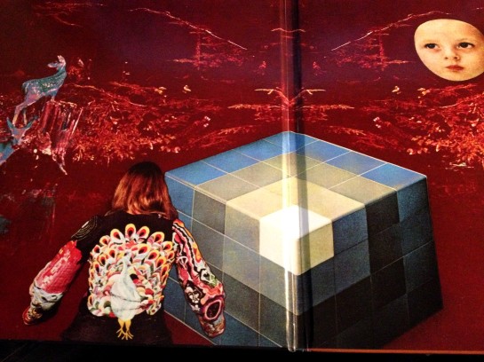
Now they say you can’t judge a book by its cover and I concur, but you can judge an LP by one, after all it is what you do when you’re flipping the sides in a record shop. I’ve always found something a bit depressing and unsatisfactory about the cover of In The Future. I can take the geometric nonsense on the front cover, but I’m not keen on the whole muted colour scheme and the inner gatefold sleeve is just, well, arse – and not in a good way! Designed by the keyboard player it seems to be an earnest representation of, umm, stuff – mostly comprising elements of the sort of art and ornaments that non-hipster grandparents cram their houses full of. It beggars belief that this is how you’d use the space inside a gatefold sleeve – hell, I could do 29 times better and I’m rubbish at art and stuff.

Listen Black Mountain, splash out, employ a professional. I know you’re a bunch of cool arty Vancouverites (Vancouverans? Vancilvanians?) who work part-time as drug counsellors, but lighten up! Guys buy more vinyl than chicks – guys like sports cars and babes^ and bright primary colours, adopt my design and I’ll triple your sales for you overnight. True.

I feel that my final product here has captured all the main points of the brief, yet retained the true essence of the band. It just screams, hairy Canadian art-rock collective to me. Oh and I added the ‘Grrr!’ bit myself.
Anyway, now I’ve improved the cover let’s generalize about the music here. It’s not great and with a pair of exceptions a lot of it sounds murky, tentative and uncertain. None of it is terrible but the production robs large swathes of it of any real dynamics, something good rock needs more than anything else.
The two tracks that poke through the murk for me are ‘Wucan’ and ‘Bright Lights’. The former is a slow-building, slightly scary creep with some excellent ensemble playing (particularly keys) which would seem to be unashamedly about anticipating /being / getting high. ‘Bright Lights’ is a fabulous damaged Floyd-esque epic which weighs in just shy of 17 minutes, with all the attendant rock outs, quiet outs, peaks and troughs which that entails; it is a really excellent track and the one I play off In The Future the most.
Just like when I bought it I wanted to like In The Future but I can’t, the new cover’s a winner though!
150 Down.
P.S – their next LP Wilderness Heart was way better.
^as proven in several scientific studies recently, most notably in 1537, J ‘Babes, Boobs and convertibles: Hell Yes!’, (2011), Harvard University Press.
If I came across your cover in the racks I’d almost certainly stop to look at it for some time. I maybe wouldn’t buy it. Just look at it.
You’re a tough hombre to sell to, I can see I may need to bring out a spiky goblin death metal version too.
I’m a pushover for Vikings. Throw a Viking in.
Reblogged this on Dee's Rock Nation.
If you could find some poor hair metal band without a graphic artist groupie, you’ve got a future in album covers!
I think there’s a market for de-seriousing LP covers. Hmmm.